
Friday, 30 August 2013
TED TALKS
As a someone who hopes to one day be a designer, being a good thinker, and having solid ideas is pretty key. When I want a good idea, when I want inspiration, looking at art galleries, studying books and browsing through tumblr can only go so far. When I feel like I need to develop a project with substance. This is the place I come to.
One of the reasons I love Youtube. Great ideas, great messages, solid advice. Everyone can take something away from these kinds of videos. Here are some of my absolute favourite TED videos.
Cameron Russell, talk about societies standard of beauty and how complexity unrealistic it is. She talks about it being a creation, the accumulation of the best stylists, photographers and retouchers the industry has to offer. As if it's all one big lie. She also talks bout the racism in the fashion industry and how non white girls are faced with an uphill battle to get work.
Richard Dawkins, a professor at Oxford University and author of the bestselling "The God Delusion" gives a seminar about simply not respecting religion. Throwing it completely out the window and looking at cold hard facts. I'm not sure I agree entirely, but it's certainly an interesting watch that re affirms my beliefs (or lack of beliefs). Looking at religion objectively can only really, truly be done when you don't abide by any.
One of the reasons I love Youtube. Great ideas, great messages, solid advice. Everyone can take something away from these kinds of videos. Here are some of my absolute favourite TED videos.
Cameron Russell: Looks aren't everything. Believe me I'm a model.
Cameron Russell, talk about societies standard of beauty and how complexity unrealistic it is. She talks about it being a creation, the accumulation of the best stylists, photographers and retouchers the industry has to offer. As if it's all one big lie. She also talks bout the racism in the fashion industry and how non white girls are faced with an uphill battle to get work.
Richard Dawkins: Militant Atheism
Richard Dawkins, a professor at Oxford University and author of the bestselling "The God Delusion" gives a seminar about simply not respecting religion. Throwing it completely out the window and looking at cold hard facts. I'm not sure I agree entirely, but it's certainly an interesting watch that re affirms my beliefs (or lack of beliefs). Looking at religion objectively can only really, truly be done when you don't abide by any.
Brene Brown: The Power of Vulnerability
I loved this one. Berne Brown comes out to share a personal epiphany, the power in being vulnerable. In a very quick summary, she talks about how it's the starting point for us to live happier, better lives. How by being vulnerable we learn to accept and embrace our insecurities, because it's what makes us human.
Hyeonseo Lee: My Escape from North Korea
It's a sad one, but an important one. Hyeoneso paints us a very sad picture of what's become of North Korea. How the totalitarian regime has impacted not just her life, but the lives of her family and everyone living there. It's story that feels like a good movie, only it's real; it's happening right now.
Steve Johnson: Where good ideas come from
Revoles around the importance of networking and sharing ideas. Communication is the key to deconstructing and reassembling existing ideas, in order to create something new. To innovate. The eureka moment doesn't really exist, it's the accumulation of a lot of time, work and trail and error. Similar ideas and themes (such as 20% time) are brought up in TED's most popular video, see "TED: The puzzle of motivation".
Thursday, 29 August 2013
Foundation 2013 (Part 1)
Thought I'd do a brief retrospective of my work... Kinda nice to look back at it now and think "Oh yeah, I did that"


Opposites (Book Art Project)

Sadly these were never used, but were meant as a graphic drawings to be put inside a much larger piece of work. Graphic drawings depicting abstract interpretations of opposites, here we see the opposites of "truth + lies" (on the left) and shape (right).
Fame Kills Dress

A dress I made for my Textiles class. I used nearly 12 ft. of Organza, and smothered the entire thing in text, reading "Marilyn", "Judy", "Britney" and "Diana" - referring to Marilyn Monroe, Judy Garland, Britney Spears and Princess Diana. Women who lived, died or suffered in the eyes of the media. The dress was designed to be traditional and feminine, but the creepy "stalker style" handwriting was meant to create a contrast to the cliché design. It was meant to strike a balance between something fashionable and conventionally pretty and something darker. Conceptually I think it's one of my strongest pieces, and really triggered a desire to investigate the idea further, the idea of "Fame Kills" was the used as the basis for my FMP later in the year.

Book Art - Rough Sketches / Texture Experimentation
An ambitious prototype that never really saw the light of day. One of the objectives of the Book Art project was to question what the whole notion of the book was. So I took it upon myself to create something that didn't in any way look like a conventional book.

This was a very rough prototype for my last Book Art piece. Using abstract drawings as a means of describing opposites, the mark making and use of texture became key. I wanted to interlink with the typology project in that each piece of paper would have a slightly different texture. Using different types of spices, coffee's or even using crushed tablets, as a means of creating different colours and textures.
Playing with Shape, Size and Dimensions

(Above) Further investigation into the final book art piece.
GANG BANG - Lyric Video Screen Shots


A project I did whilst I was on Foundation but never got around to finishing it. I think it might be about time I went back...
It's Not How Good You Are, It's How Good You Want To Be, Paul Arden (Book Review)
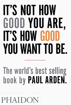
I'll be honest. The joy of reading was never something that ever really struck me... Am I still allowed to blame television? Meh, probably not. So being given a mandatory reading list from my future University was a bit of a bummer if I'm honest. But low and behold, Paul Arden did the impossible, he gave me a book that could actually class as some kind of... recreation. SHOCK HORROR! What have I become?
It's Not How Good You Are... can be read in all of an hour, and it's an incredibly good read. It's simple, cut's straight the point and surprisingly easy to digest and take in. The title might lead to believe it's a book intended to help anyone in the business world, but it's centred around the advertising industry and is generally geared towards more creative minds. So to some might be somewhat misleading, but even if it's not your field of practice it's a still a great pocket book for anyone eager to excel in the world of work, as most of the it can be applied to any kind of business.
As the summary says, the advice is simple and I guess a little old fashioned but is that a bad thing? Lord no. It really does take you back to basics and words things in a straight forward, yet logical manner. I read this book coming home form a trip to Cardiff as soon as I realised how short the whole thing was, and for most of that train ride, I nodded my head, grinned like an idiot and had one or two bursts of laughter emerge. The comment about Victoria Beckham and the Persil Automatic was pretty hysterical.
All in all It's Not How Good You Are, is simple, to the point and crammed to the brim with useful information. It's as entertaining as it is insightful and logical. I wasn't going to do a rating system... but for the first ever book I've managed to get some genuine pleasure out of reading, what the hell; I'll bite. I'll give Paul Arden's self proclaimed "business bible" (I concur btw) a ...
9/10
Wednesday, 28 August 2013
Lady Gaga - Applause (Music Video Review) + The "ARTPOP" Concept
I'm not ashamed to admit I'm a huge fan of anything Pop culture, it's one of the reasons Pop Art was so predominantly featured in my work throughout A-Level. And as you've gathered I'm a bit of a Gaga fanatic, but it's only because she's one of the only Pop stars out there right now that's genuinely interested in Art and the science behind pop culture and celebrity. I'm also a huge media freak, and I'm obsessed with using video in my projects. The following is a link to my attempt at making a music video two years ago... granted my German is horrible, but I actually think the outcome is pretty good considering.
(And dear LORD please ignore the description box, I swear I'm not nearly as annoying as I sound)
Applause is her latest music video, coming straight from the minds of herself and Inez and Vinoodh, the Dutch fashion paring. Granted if we're looking at Applause as a music video, let's be honest it's no Bad Romance. But in terms of actual artistry, Applause is her most visually compelling and thematically interesting video to date. (See the link below to watch it for yourself)
The concept revolves around transformation, and we see Gaga playing homage to her former selves, showing her ability to reinvent herself time and time again. Which plays into the theme of a Magic Show, explaining the use of the grossly oversized top hat used at the beginning of the video and the fact that the whole video looks as if it were shot on some sort of stage. We see references to four different Gaga's, pre fame, breakout (Poker Face), her status as a bonified pop icon (bad romance), her Born this Way era, and finally where she is now. And it plays into the idea that Gaga isn't really a person, but more of a character, who's capable of morphing and shifting her personality, image and sound to create a completely new brand for herself and appeal to whole new demographic. A feat not done as well since the days of Madonna. There's a famous quote by fashion photographer Richard Avedon, stated after a session with Marilyn Monroe "There's no such person as Marilyn, she's an invention, a genius invention". In my opinion the same can be said for Gaga, she's a living breathing cartoon character (in the best possible sense).
Gaga has previously stated her album "ARTPOP" is the direct opposite of what Andy Warhol did with the Pop Art movement. As opposed to putting pop culture into art, it's in Gaga's intent to put art into pop culture, and with her recent collaborations with Jeff Koons and Robert Wilson it's an ideal she's eager to achieve.
Visually Applause strikes contrasts between bold colour and black and white. On a whole it's pretty eclectic. Playing into the idea of transformation and Gaga's ambition to play the role of anyone or anything. It's as if the aesthetic has been worked into the concept development. On top of that, simple black backdrops are balanced with highly eccentric fashion, and bizarre set pieces (see the Gaga swan).
Applause does bite off more than it can chew at times, but that's not a bad thing; not in this context. Gaga's larger than life persona (along with larger than life ambitions) kinda runs a nice parallel to the clusterfuck that is most of video's content. It's an all visual assault, and crams an insane amount of imagery and ideas into a relatively short three and a half minutes. Once dissected and isolated however, everything become a LOT more clear, and you're left with a relatively coherent beginning, middle and end.
Friday, 23 August 2013
Layout Concept #01


And designers worst nightmare has emerged... missing a god damn E in Blueprint... LORD how on this earth did I pass English GCSE?

Check out...
There's a whole load of blogs out there geared towards graphic design and all things related, but I thought I'd give a quick run down of some of the best ones I've had the pleasure of coming across.
01 - http://www.septemberindustry.co.uk
ABOUT:
SI has always been about quality not quantity since day one which is why the site isn’t updated daily but rather biweekly or triweekly.
If you’re looking for a carefully curated selection of the very best contemporary graphic design — exceptionally crafted work that truly inspires — you’ve come to the right place. SI prides itself in showcasing large/exclusive images of each project contributed by the original designers, studios and photographers (not just taken directly from their site). We don’t do anything smaller that 800px wide because you can’t truly appreciate the finer details in the “blog-friendly” 500px wide format.
Unfortunately the current version of this site doesn’t have pagination on the front page (that will change when the new design rolls out sometime this year). So in the meantime have fun browsing the visual categories for the older stuff and don’t forget to follow SI on Twitter and Subscribe for the latest updates.
Thank you for listening. We hope you enjoy your stay ;)
02 - http://designyoutrust.com
ABOUT:
Design You Trust is a hourly-updated collective design blog and community, full of new design trends, news and events, great design portfolios, young design bloods, design articles, photographies, fashion, creative advertisements, architectural inspirations, video design and hand-picked design stuff from all over the globe.
Join Design You Trust community on Facebook, Google+, Pinterest, follow us on Twitter and subscribeto our RSS Feed!
Explore our fantastic deals for design community: themes, icons, freebies, vectors, games, gadgets and many more.
Design You Trust was founded in 2007 by Dmitry Utkin. Feel free to contact me atdesignyoutrust@gmail.com and send your comments and suggestions. I’m committed to helping you find the right answers to your questions and concerns. Your information will be kept confidential.
03 - http://www.bitique.co.uk
04 - http://swisslegacyatelier.tumblr.com
Tuesday, 20 August 2013


Mixed Media
So whenever I get down and work, it's not just graphic designers and artists that I look to for inspiration. There's a whole bunch of other media's I use, music, movies and even something as obscure as a video games all bring something new to the table. And to some degree they can ALL be classified as "art", if it can make you feel something, if it can challenge you in some way; to a certain extent that's what art is supposed to do.
Music is a big one for me, when your pulling all nighters trying to finish something for a crit the next day, music is exactly you need to keep your adrenaline going; that a whole load of caffeine. It also helps get you into a certain type of head space, depending on what the brief asks for, listening to a certain type of music really helps. Take my experience last year with foundation, my first brief was to question the notion of the book, so I took that very literally and thought about what the books true purpose was? To distribute information, so technically television and music can serve the same purpose, just through a totally different medium, so that's what I did; i wanted to distribute information through visually and sonically. Choosing one of Madonna's most theatrical tunes "Gang Bang", a song which tells the story of a women's revenge to kill her cheating boyfriend. I used to the music to inspire the video's visuals, I took to Photoshop and Illustrator and literally designed a new slide for every word of the song; it resulted in being one of the most strenuous pieces of work I'd ever done, designing and illustrating around nearly 500 slides for the video; all of them unique; all of them inspired by the track. I needed to pick a song which I could milk a lot of imagination from, and I think I did just that. In terms of concept I developed my own interpretation, taking inspiration from her MDNA tour with an art film for Nobody Knows Me" I wanted to study the idea of subliminal messaging and "reading between the lines" in a political and cultural sense. The idea was to develop something chaotic but tasteful. A mess of imagery but substance.
Madonna's Gang Bang
Some of my favourites...
Same case with movies, and much more obviously; when you come across a movie like Cell, Drive or Mulholland Drive, something really wonderful happens. It's rare when you see a film that really takes you back visually, but the ones which do are always great for sparking up imagination and delating artists block. Their out there there, you just need to look for them.
A couple of examples...
Mulholland Drive
Drive
Traffic
Cell
Memento
Kill Bill
Perfect Blue
Metropolis (2001 Anime)
Another go-to for me is video games. Not only can they mix and combine audio and visuals (already serving the same purpose as a movie) the interaction you have with it is what makes it such a special and UNIQUE experience. Not many people bother to acknowledge that video games are often just as culturally relevant, innovative and important as any great movie or piece of art. Granted the actual audience of a game like Call of Duty (sort of the video game equivalent to a movie franchise like Twilight, draws huge numbers but next to everyone hates it) revolves around foul mouthed pre pubescent teenage boys. But there's so much to be seen with games like Mirrors Edge, Bioshock Infinite , The Last of Us, Portal 2 or the Mass Effect series. Think about what games let you do, they let you play out all of your fantasies from the comfort of your own living room, just think about where that concept can take us in a few years.
Some of my favourites...
Mass Effect
Bioshock: Infinite
Mirrors Edge
Portal 2
The Last of Us
Silent Hill
Final Fantasy
Deus Ex: Human Revolution
I hope to develop on this post in the future. Maybe even use some the ideas mentioned here as the foundations for future projects.
Music is a big one for me, when your pulling all nighters trying to finish something for a crit the next day, music is exactly you need to keep your adrenaline going; that a whole load of caffeine. It also helps get you into a certain type of head space, depending on what the brief asks for, listening to a certain type of music really helps. Take my experience last year with foundation, my first brief was to question the notion of the book, so I took that very literally and thought about what the books true purpose was? To distribute information, so technically television and music can serve the same purpose, just through a totally different medium, so that's what I did; i wanted to distribute information through visually and sonically. Choosing one of Madonna's most theatrical tunes "Gang Bang", a song which tells the story of a women's revenge to kill her cheating boyfriend. I used to the music to inspire the video's visuals, I took to Photoshop and Illustrator and literally designed a new slide for every word of the song; it resulted in being one of the most strenuous pieces of work I'd ever done, designing and illustrating around nearly 500 slides for the video; all of them unique; all of them inspired by the track. I needed to pick a song which I could milk a lot of imagination from, and I think I did just that. In terms of concept I developed my own interpretation, taking inspiration from her MDNA tour with an art film for Nobody Knows Me" I wanted to study the idea of subliminal messaging and "reading between the lines" in a political and cultural sense. The idea was to develop something chaotic but tasteful. A mess of imagery but substance.
Madonna's Gang Bang
Some of my favourites...
Lady Gaga - The Fame Monster
Betty Who - The Movement
Natalia Kills - Saturday Night
Robyn - Body Talk
Hurts - Exile
Madonna - American Life
Anything by Hans Zimmer.
Same case with movies, and much more obviously; when you come across a movie like Cell, Drive or Mulholland Drive, something really wonderful happens. It's rare when you see a film that really takes you back visually, but the ones which do are always great for sparking up imagination and delating artists block. Their out there there, you just need to look for them.
A couple of examples...
Mulholland Drive
Drive
Traffic
Cell
Memento
Kill Bill
Perfect Blue
Metropolis (2001 Anime)
Another go-to for me is video games. Not only can they mix and combine audio and visuals (already serving the same purpose as a movie) the interaction you have with it is what makes it such a special and UNIQUE experience. Not many people bother to acknowledge that video games are often just as culturally relevant, innovative and important as any great movie or piece of art. Granted the actual audience of a game like Call of Duty (sort of the video game equivalent to a movie franchise like Twilight, draws huge numbers but next to everyone hates it) revolves around foul mouthed pre pubescent teenage boys. But there's so much to be seen with games like Mirrors Edge, Bioshock Infinite , The Last of Us, Portal 2 or the Mass Effect series. Think about what games let you do, they let you play out all of your fantasies from the comfort of your own living room, just think about where that concept can take us in a few years.
Some of my favourites...
Mass Effect
Bioshock: Infinite
Mirrors Edge
Portal 2
The Last of Us
Silent Hill
Final Fantasy
Deus Ex: Human Revolution
I hope to develop on this post in the future. Maybe even use some the ideas mentioned here as the foundations for future projects.
Monday, 19 August 2013
Museums, museums and yet more museums...
So it's been a bit of a cluster fuck of a year for me... with getting University sorted out and everything, it turned out I needed to take a more than just a few trips up to London (for interviews, open days all that jazz) and in doing so I thought I may as well make use of London's vast array of museums and art galleries. Turns out I didn't have NEARLY enough free time to cover as much ground as I would have liked, but we made use of the heavy weights.
Firstly the Tate Modern. Haven't been here in a while... I visited TTM when I was ten, and obviously at ten you know nothing about art, but I remembered the experience as a pleasant one. Looking at TTM now, I've obviously developed a new found appreciation for the subject, having said that a good chunk of what was on show went over my head completely. I came across some amazing Francis Bacon pieces and got the chance to discover new artists, John Heartfield being one of them; I came across a giant wall filled with his satirical commentary on Nazi propaganda with 50 beautifully fashioned. posters

I also came across a Swiss installation artists by the name of Thomas Hirschhorn, his piece "Candelabra with Heads", showcasing a collage of mannequin parts all wrapped up and stuck together. It was gaining quite a lot of interest from the crowed, and honestly kinda struck a chord with me; I'm not big on installation art, the top floor (which was ALL installation) bored me to tears, but this one was different, there was a creepiness to it that kinda fascinated me, it got me to look up a lot more of his work. Other than the excessively over priced gift shop, it was a pretty pleasant experience.

While we were there my Dad took me to see The Design Museum. Kinda crucial for someone who wants to pursue a career in design so this was a big priority for me, unfortunately the exhibition they had on at the time couldn't have been further away from what I'd expected to see, it revolved around the literal design of sports cars, sports equipment and all things SPORT related... the only thing I took away from the experience was absolutely disgusting at how vastly underpaid women are in sport, seriously it's a crime. The upper floor was a lot more to my taste, it wasn't strictly graphic design, but it was cool - it shows a bunch of light installations, many of which were interactive. It's exactly what I expected; but then again I should have pre anticipated that "DESIGN" covers a much much broader spectrum.

Later in the year, I travelled over to Madrid to see my Dad. And it was a no brainer, Museums were a PRIORITY. We were smack bang in the centre of one of Europe's biggest and most culturally important cities. So off we headed to the Reina Sofia Museum of Modern Art, operation GUERNICA! It was finally happening, Guernica to me was nothing more than a 10 by 6 inch title hanging above my bed all my life, now I was going to see the real deal, in the flesh. And it was pretty amazing. Seeing the detail of the brush strokes and getting up close to the concept sketches was really special for me.

And in the spirit of spending my last few weeks in Wales, I thought I might aswell take one last look at our National Museum and finally get around to seeing the refurbished galleries. So me and my sister hopped onto the train that took us to Cardiff's National Gallery and we had a good snoop around. It was years since I went there, so it was a pleasant surprise that they had a couple of Picasso's, Monet's and Mondrian's lying about...
I'll post some images we took a little later
Gotta admit though, I'm more than prepared to get my own ideas on paper, I've been gazing at other peoples for long enough.
Saturday, 17 August 2013


30# BRITNEY SPEARS

NAME: Britney Jean Spears
PROFESSION: Singer, Entertainer
NATIONALITY: American
OFFICIAL WEBSITE: http://www.britneyspears.com/index.aspx
Britney Jean Spears. Okay, don't judge me. Who doesn't like Toxic? I've got a affinity for pop stars and you don't get much more iconic than Britney. A women who I don't think even realise or understands how interesting her life is. She's the definition of what I've been talking about all this time in relation to fame, when you get to the top there's no where left to go but down; the public couldn't get enough. Seeing the hottest thing to hit pop music shave her head, go to rehab, loose custody of her two children and attack a sports car with an umbrella quite literally shook the world.
Oh yeah. And her music is catchy as hell. Enjoy the bops ya'll.
29# BROM

NAME: Gerald Brom
PROFESSION: Illustrator, Concept Artist
NATIONALITY: American
OFFICIAL WEBSITE: http://www.bromart.com
Originally a commercial artist, Brom transitioned rather smoothly (as early as his 20's) into conceptual artwork for books, movies and video games. With an incredibly distinctive style: basing his sexy, spooky, monster like drawings on the Dungeons and Dragons board games. I've always been really obsessed with dark, quirky imagery and Brom is always on hand to astonish with his sinister, overly yet cartoony paintings.
28# BARBARA KRUGER

NAME: Barbara Kruger
PROFESSION: Conceptual Artist
NATIONALITY: American
OFFICIAL WEBSITE: http://www.barbarakruger.com
One of the (if not thee) most well known and respected conceptual artists of all time. Her incredibly distinct pieces and her colossal installations (namely the Frankfurt shopping department) are evident that text is a powerful thing. She disputes being called a political artist, instead she prefers just being seen as an artist with something to say. Even though her play on George Bush "Life for the unborn, death for the unborn" is my favourite piece from her, I chose her best known piece. "Your body is a battle ground", a commentary on a woman's right to choose.
27# JOEL PETER WITKIN

NAME: Joel Peter Witkin
PROFESSION: Photographer
NATIONALITY: American
OFFICIAL WEBSITE: N/A (His work can be viewed) here http://www.edelmangallery.com/witkin.htm
Say what you will about Joel Peter Witkin, he certainly knows how to get your attention. Throughout a career spanning five decades, Joel has constantly strived to provoke and question the notion of what makes an image beautiful, by using all the things we don't associate with beauty. In fact it's more the exact opposite; dismembered body parts, decapitated heads, burn victims... the list goes on. It's not so much the subject, but the context, the composition, when it's right in front of you, it just works. And despite whether or not you agree with that, you can't deny his originality, or ability to shock.
26# DAVID CARSON

NAME: David Carson
PROFESSION: Graphic Designer
NATIONALITY: American
OFFICIAL WEBSITE: http://www.davidcarsondesign.com
No introduction necessary.
TED: David Carson - Design Discovery and Humour
David Carson - The Rules of Graphic Design
25# H.R. GIGER

NAME: Hans Rudolf Giger
PROFESSION: Set Designer, Surrealist Painter, Sculptor
NATIONALITY: Swiss
OFFICIAL WEBSITE: http://www.hrgiger.com
H.R. Giger, painter and set designer extraordinar. I love his nightmarish, slightly grotesque style of imagery. There's a very distinct sci-fi veneer with almost all of his work which initially drew me to research him; after discovering he was the man behind the "Alien" design. His work has just as much chance of creating a sense of awe as it does to revolt you. He's got a knack for making the viewer feel uncomfortable, something I can appreciate.
24# QUENTIN TARANTINO

NAME: Quentin Tarintino
PROFESSION: Director
NATIONALITY: American
OFFICIAL WEBSITE: N/A (Information on his work can be viewed here http://www.imdb.com/name/nm0000233/)
One of the best known, successful and critically lauded film directors of all time. Tartintino has been blessed with an outstanding repertoire of action movies. Unlike his contemporaries, Tarantino takes a very different approach to his craft. He never let's the work take itself too seriously; he understands the audience is there to have a good time, and he gives them just that: outrages battle scenes, hilarious dialogue and totally random interjections of music all come to together to create very camp but ultimately entertaining pieces of work. Inglorious Bastards and Kill Bill Vo. 1 remain my favourites from him.
23# THOMAS HIRSCHHORN

NAME: Thomas Hirschhorn
PROFESSION: Installation Artist
NATIONALITY: Swiss
OFFICIAL WEBSITE: N/A (However a collection of his work can be viewed here) http://www.diaart.org/exhibitions/main/125
I came across Thomas Hirschhorn earlier in the year when I visited the Tate Modern, his piece "Candelabra with Heads" really caught my eye, featuring a row of mannequin heads wrapped in mounds and mounds of brown tape, to the point where they looked like giant tumours. I've always had this weird, unexplainable fascination with mannequins, so to see a piece of art in the Tate Modern (of all places) make such point of using them I was very intrigued. I found out the Hirschhorn is well known for his huge installations, corresponding with themes of consumerism, war, politics, media and capitalism. He uses simple materials that everyone has access to, and turns them into grand sculptors.
22# VIKTOR & ROLF

NAME/S: Viktor Horsting & Rolf Snoeren
PROFESSION: Fashion Designers
NATIONALITY: Dutch
OFFICIAL WEBSITE: http://www.viktor-rolf.com/intro/
I've followed Viktor & Rolf for a while now and always go back and take a glance through one of their books if I feel zapped of ideas. Their a Dutch design duo, hell bent on making the craziest, most obscure, most inconceivable designs come to life; and they do a damn good job at it. Two men that define the term haute couture fashion; their designs aren't meant to be practical or to be worn walking down your local high street. They literally make wearable pieces of art.
21# FRANCIS BACON

NAME: Francis Bacon
PROFESSION: Artist
NATIONALITY: Irish
OFFICIAL WEBSITE: http://www.francis-bacon.com
National treasure (even though he’s not
even British), painter and very disturbed human being Francis Bacon has always
been someone I’ve referenced and taken inspiration from over the years. I first
came across his work during first year of A-Level, studying and deciphering his
giant oil paintings, depicting nightmarish like interpretations of Popes
throughout the 1940’s and 50’s. It’s safe to say his work has stuck with me
ever since.
Friday, 16 August 2013
20# FERNANDO VICENTE

NAME: Fernando Vicente
PROFESSION: Artist
NATIONALITY: Spanish
OFFICIAL WEBSITE: http://www.fernandovicente.es
I’ve only managed to scoop a little information
on Fernando Vicente. The information is there available, unfortunately I don’t
speck Spanish and Google Translate can only do so much before you realise you
haven’t a clue what’s trying to be said. What I can say, is that his work is
absolutely gorgeous and I continue to reference him three years after first
discovering him. His work revolves around a sort of modern day interoperation
of vanitas; his work typically features young beautiful women with various
sections of their face and body exposing layers of skin, muscle, bone and
bodily organs. It’s that wonderful combination of the conventionally beautiful
and the grotesque.
Subscribe to:
Comments (Atom)